Description




Business, Marketplace, Retail
“If you build it, they will come”
Focussed on user experience first WoodMart uses a powerful AJAX tech to give users a very fast and seamless online shopping interface without the need to constantly refresh pages.
All-In-One eCommerce Solution
The most important features come out of the box and you don’t need to purchase anything extra. Wishlist, compare, product swatches, AJAX filters, built-in slider and other features.
Settings Panel
With a powerful Settings Panel that allows you to change a plethora of Settings with a single click.
Fully Customizable
Everything has been tweaked and developed to respond to your customization requests with a minimum of fuss so what you are left with is a highly customizable website that can adapt to your change requests easily and quickly.
Change up your fonts, update your colour palette to you meet your brand guidelines, update your swatches to show multiple product variations – it’s all accessible from the familiarity of the intuitive dashboard.
Optimized for Google Page Speed
Website performance is one of the key factors for Google rankings starting from 2021. We spent hundreds of hours experising and implementing the best practice techniques in speed optimization and performance field. It has a unique mechanism to load CSS and JS files only on pages where they are needed. And it will reduce the total page size by 2-3 times comparing to other Websites.
Responsive Design
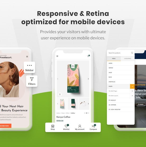
Of course it features a completely responsive design that manipulates itself to best suit the device it is being viewed on. This means you can carry on with the best part like listing items for sale, creating a killer shop and leaving the technical stuff up to the developers.
We guarantee that your website will display fluidly across every device type you can think of without any extra effort on your part – laptops, PCs, smartphones and tablets – have been carefully thought out and included in this smart website design.
Retina Ready
We’ve also made sure that your website will display with the highest possible pixel density as per users device. If that happens to be a retina ready device then that display will light up with colors that are simply out of this world.
Make the most of your photography with this retina ready, you won’t regret it.
SEO Optimization
SEO is like the hottest buzzword of the decade but put simply it means that your website needs to be coded a certain way so that Search Engines like Google and Bing can find the right stuff it needs to, to rank your page correctly.
This means clean code, well designed, and support for almost all popular SEO plugins that give you more control over use of the right metadata in the right place, and being free of bloat.
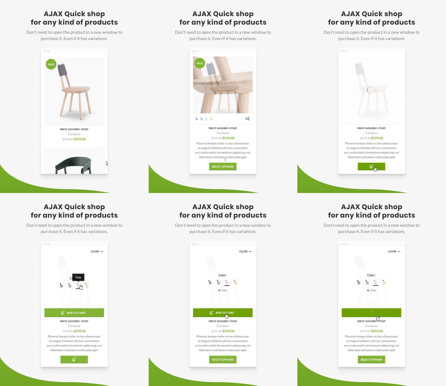
Powerful AJAX
AJAX or Asynchronous Javascript and XML, is a group of techniques used in web development that allows a web page to communicate with a server without reloading the page. This is best witnessed when searching through products. You know you haven’t got an AJAX powered site when every category change or product swatch update you make the whole page flickers and reloads.
Using the best tech available we have gotten away from that problem with galleries of products of any kind with stacks of possible types and kinds that simply update as you select them. It provides your customers with the kind of experience you’d expect in a leading marketplace online today.
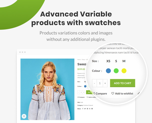
Advanced Variable Products
Being able to apply multiple product variables and swatches to products in your store is a must. It is optimized by allowing you to have one listing but show many colours for instances, or a certain product that has multiple sizes, types, styles, purposes.
This gives your shop so much more depth with every product being able to have multiple attributes and variations, and as soon as they are added to your Cart they appear, no page reloads, no refresh necessary. Once you’ve tried it there’s no looking back.
Drag & Drop Header Builder!
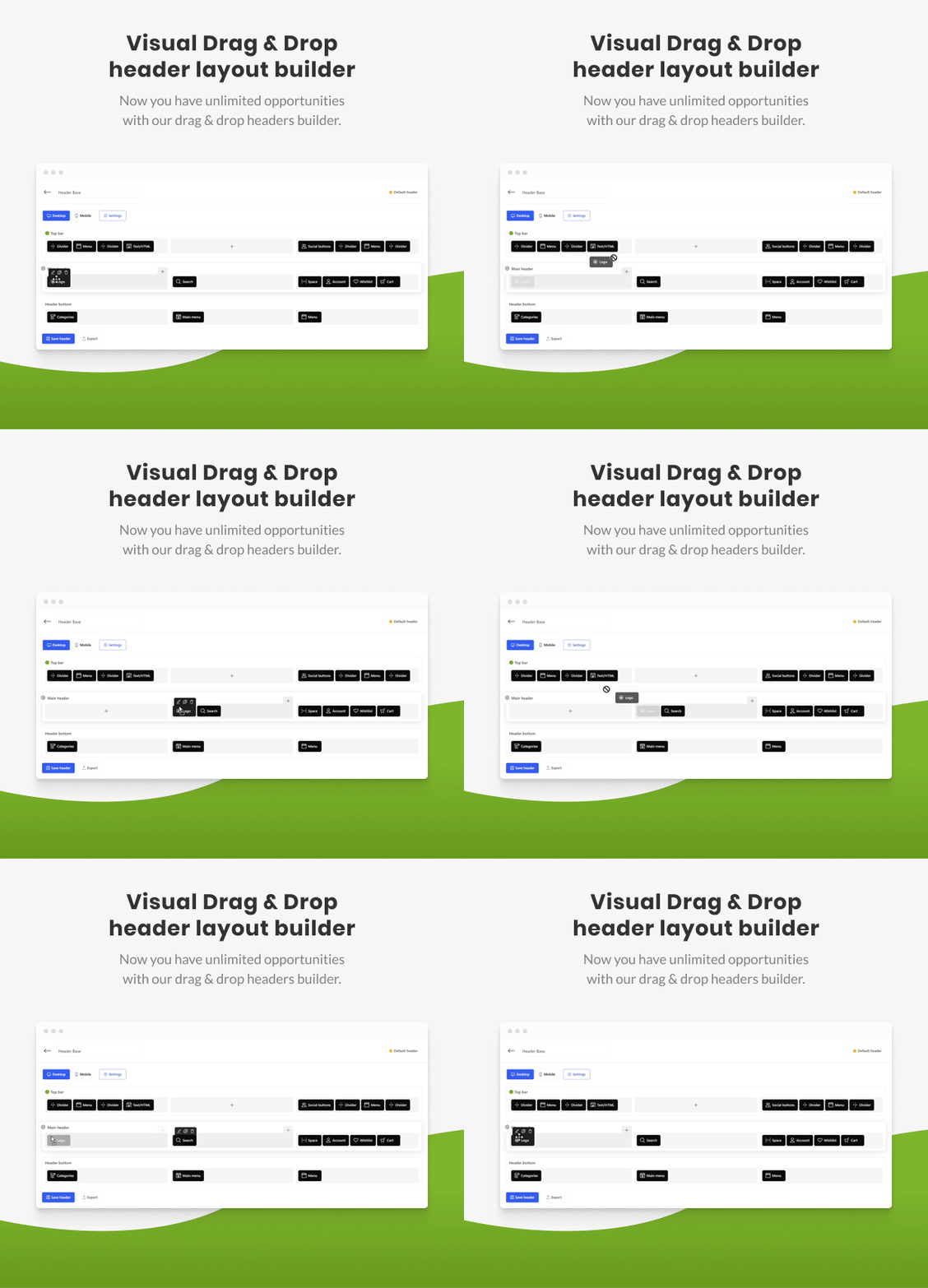
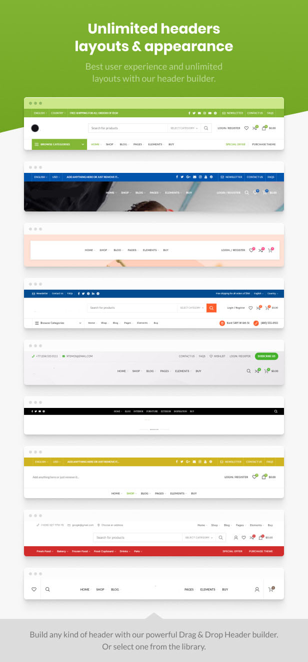
A great user experience often starts with an awesome header design, and as silly as that may sound to some it is often overlooked. A powerful ‘Drag & Drop’ header builder that gives you complete control over designing your headers. Drag blocks into place, label them, update background images, colours, borders, padding you name it. All with a simple GUI that anyone can use to build something really unique.
Feature List
- 100% Responsive & Retina ready
- Multilanguage ready
- RTL ready demo
- GDPR compliant
- Online Documentation
- 24/7 Support forum
- Video tutorials
- Drag & Drop Header Builder
- Clean and well-organized codebase
- PHP Object-Oriented standards
- Minified JS and CSS files
- 22 languages included more info
- English
- Dutch
- Spanish
- Russian
- Greek
- Bengali
- French
- Italian
- Turkish
- German
- Persian
- Ukrainian
- Hungarian
- Arabic
- Slovak
- Polish
- Romanian
- Czech
- Danish
- Hebrew
- Estonian
- Indonesian
- Georgian
- Cross Browser Compatibility: FireFox, Safari, Chrome, Edge
- Custom CSS & JS in Theme Settings
- AJAX shop filters
- AJAX search
- AJAX Add to cart for all products
- Infinite scrolling for the shop page
- Attributes swatches
- Swatches on shop page
- Lazy loading for images
- Drag & Drop mega menu
- Page Builder included
- Slider included
- Full Toolset compatibility for custom stores
- Multi vendors supported
- Wishlist & Compare built-in
- 40+ Custom Page Builder elements
- Advanced mobile-side navigation
- 4 container layouts
- Full Width
- Boxed
- Content full width
- Wide (1600 px)
- 3 sidebar position
- Left sidebar
- Right sidebar
- Full width
- Different sidebar size
- Advanced page heading settings
- Advanced header customizations options
- 3 Header layouts for mobile devices
- Sticky header
- Sidebar login widget
- Full Screen Menu
- Customize header height
- Custom logo for the header and for sticky header
- Logo paddings and responsive options
- Transparent header
- Header background and text color scheme
- Top bar color schemes
- Different shopping cart icons
- Upload custom icons for header elements
- Different menu hover styles
- Different search layouts
- Free shipping progress bar
- Products stock progress bar
- Product size guides
- Product visitors counter
- Product units of measurements
- Custom product labels
- Show variations as products
- Frequently bought together
- Linked variations
- Advanced product reviews
- Product video
- Dynamic discounts
- Product sold counter
- Search by SKU
- My account links in the header
- Login form dropdown in the header
- Social login/register with
- Custom 404 pages
- Parallax on scroll on single image and columns
- 12 + Footer layouts
- Footer color schemes
- 2 copyrights layouts
- Prefooter area
- Sticky footer
- Custom Typography options
- All Google fonts included
- Typekit fonts supported
- Upload your custom fonts
- Unlimited Colors
- Background for pages content
- Different Buttons styles
- 3 Styles for HTML forms
- Square
- Rounded
- Underline
- 5 Blog designs
- Default
- Alternative
- Small images
- Chess
- Masonry grid
- Blog columns: 2, 3, 4
- Blog styles: Flat, with shadows
- Share buttons for blog posts
- Author biography section
- Related posts slider
- Infinite scrolling and “Load more” button
- Different portfolio styles
- Infinite scrolling portfolio
- Portfolio categories filters
- Shop filters area
- Hover image for shop page
- Countdown timer for sale products
- Built in Quick View
- Sticky add to cart button
- Variations on quick view
- AJAX add to cart for variable & grouped products
- AJAX remove from cart
- “Products per page” function on frontend
- Choose number of products columns on frontend
- Different space between products
- Masonry grid shop page
- 8 Product hover effects
- 3 Product categories styles
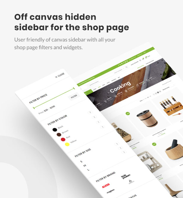
- Off-canvas sidebar. Can be enabled separately for mobile/tablet/desktop
- Shop title with categories menu
- Attribute swatches for variable products
- Brands for products
- Filter by brand
- Brand description in product tabs
- Catalog mode option
- Cookie law info popup
- Advanced Promo popup options
- Show popup after some time
- Show after number of pages visited
- Show on user scroll
- Accordion function for product categories widget
- Nice Scroll for filters widgets
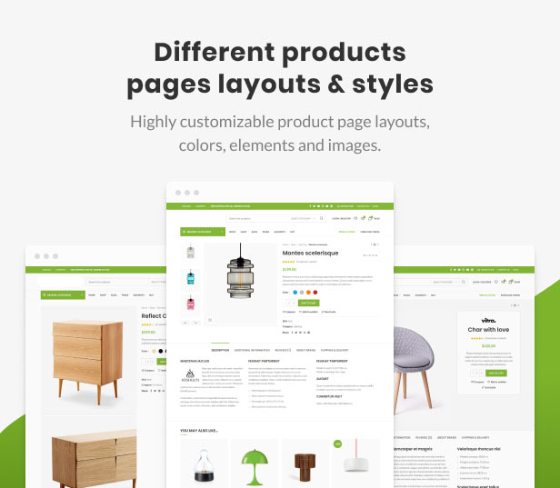
- Different product page designs
- Sticky product information
- Sticky product images
- Product description with shadow
- Product images zoom
- 6 Product thumbnails layouts
- Left (vertical position)
- Bottom (horizontal carousel)
- Bottom (1 column)
- Bottom (2 columns)
- Combined grid
- Without
- Photoswipe gallery for images
- Share buttons for product page
- Different tabs layouts: tabs, accordion
- My account page tabs
- Maintenance mode option
- HTML Blocks post type
- WIDGETS
- AJAX Search
- Author information
- Banner
- HTML Block
- Price filter
- Recent posts
- Sidebar mega menu
- User panel
- Layered navigation
- Advanced Google Maps element
- Custom Google maps styles
- Gradients for rows and titles
- Section dividers
- Parallax for rows
- AJAX Products tabs WPBakery Page Builder element
- Quantity +/- buttons for products
- SVG logo image


